汉字的外形方方正正,这一特点使其很容易与世界上其他国家、民族和地区的文字区别开。汉字的字形丰富多样,充满了节奏韵律。每一个汉字都是一件充满魅力的艺术品,而且还可以通过书法、象刻、诗词及对联等艺术形式,向大众彰显其独特魅力。
Chinese characters, with their square appearance, stand out distinctly from the scripts of other languages worldwide. The richness and diversity of written Chinese, characterized by its rhythmic nature, endow each character with an artistic allure akin to a captivating masterpiece. This charm is exuded through various art forms such as calligraphy, seal carving, poetry, couplets, and more.
>汉字与书法
> Chinese Character and Calligraphy
汉字的美最为突出地表现在其外形:或俊秀飘逸、或雄劲沉稳的线条,或疏密相间、或紧凑别致的布局。所谓“书画同源”,指汉字的起源与图画密切相关,汉字向书法艺术的发展可谓有迹可循。书法,是汉字、蒙古文、阿拉伯文等世界上少数几种文字的艺术表现形式。中国书法,是中国汉字特有的一种传统艺术,被誉为“无言的诗、无行的舞、无图的画、无声的乐”
The true beauty of Chinese characters is most strikingly evident in their written form, characterized by elegant or robust lines and a harmoniously structured layout. An age-old adage states, "Calligraphy and painting share the same origin," underscoring the intimate connection between the inception of Chinese characters and drawing, which illuminates the evolution of calligraphy itself. Calligraphy stands as an art form exclusive to a select few written languages globally, notably Chinese characters, Mongolian, and Arabic. Specifically, Chinese calligraphy stands as a distinctive traditional art form intertwined with Chinese characters, revered as an art akin to "wordless poetry, lineless dancing, imageless painting, and soundless music."
书法可谓无处不在,在中国画、中国扇、楹联、匾额、建筑、剪纸等实用物体或艺术作品上都能看到书法的身影。优美的汉字不仅仅是一种装饰,更是一种文化的象征,古人用文字的形式表达美好的愿望。
Calligraphy exerts a pervasive influence, extending its essence into various practical and artistic endeavors, including Chinese paintings, fans, hall columns adorned with couplets, inscribed boards, architectural structures, paper-cuts, and more. Beyond their ornamental value, the exquisite Chinese characters also encapsulate profound cultural significance, enabling the ancients to convey their heartfelt well-wishes and aspirations.
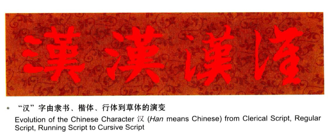
汉字的书体变化主要是指汉字笔势和体态的变化,分为古体和近体。古体包括甲骨文、金文、籀文、六国古文;近体包括小篆、隶书、草书、楷书、行书等。其中篆书、隶书、楷书、行书、草书构成了中国书法的五种字体,每种字体都有各自鲜明的特征,篆书古朴、隶书率真、草书潇洒、楷书工整、行书流畅。汉字的书法之美主要体现在点画用笔、结体取势以及章法布局三方面。
The calligraphy of Chinese characters can be broadly categorized into two styles: archaic and modern, based on variations in writing momentum and posture. The archaic style encompasses oracle bone script, bronze script, Zhouwen (similar to small seal script but with overlapping structures), and the Ancient Script of the Six States. On the other hand, the modern style comprises small seal script, clerical script, cursive script, regular script, and running script. These styles—seal script, clerical script, cursive script, regular script, and running script—each possess distinct characteristics. Seal script embodies a primitive simplicity, clerical script exudes directness and sincerity, cursive script projects a dynamic elegance, regular script emphasizes tidiness, while running script flows smoothly. The allure of Chinese calligraphy chiefly resides in the artistry of brushstrokes, the configuration of characters, and the overall composition.
点画用笔之美
Beauty of Strokes and Dots in Brushwork
点画即文字的笔画,其外形有肥瘦、长短、方圆、曲直、断连等区别,其质地又有刚柔、强弱、浓淡等不同。用笔即用笔的方法,也叫“运笔”、现在普遍称其为“笔法”、包含提按、逆顺、转折、顿挫、迟速等变化。
The strokes within Chinese characters exhibit variations in both appearance and texture. In appearance, strokes can appear thick or thin, long or short, rounded or squared, straight or curved, connected or broken. Similarly, in texture, strokes can convey rigidity or flexibility, strength or delicacy, depth or lightness. The technique of manipulating the brush, formerly termed "brush usage" by ancient scholars, is now commonly known as brushwork. This brushwork encompasses diverse movements such as lifting and pressing, advancing and retracting, turning and breaking, ascending and descending, as well as slow and rapid strokes.
点画用笔就是运用一定的技巧书写各种各样的笔画形态、形成不同的艺术效果。每种书体都有不一样的点画用笔,同一种书体的点画用笔也根据书写者自身风格的不同而有所差异。掌握了用笔,也就掌握了书法的点画线条,这是决定书法优秀的关键所在。好的书法, 其点画用笔一定是生动、立体、富有美感的。如果没有掌握好点画用笔,出现“点画八病”,那么就一定写不出好的书法作品。
Through specific writing techniques, calligraphers can create a range of strokes, leading to diverse artistic effects. Different styles of calligraphy also exhibit distinct brushwork characteristics. Moreover, even within a single style, strokes may vary based on the individual calligrapher's personal style. Proficiency in controlling strokes or a deep understanding of brushwork significantly influences the quality of a calligraphic piece. Outstanding calligraphy typically showcases lively, three-dimensional, and aesthetically pleasing strokes. Failing to grasp the essentials of brushwork or succumbing to any of the eight listed faults can hinder the creation of a commendable calligraphic work.
结体取势之美
Beauty of Character Configuration
结体取势是指书法写作者通过一定的结体技巧,根据各自的审美情趣来塑造汉字的理想体势。结体,又称“结字”,指汉字书写的间架结构。通过对汉字点画进行疏密、聚散、正斜、高低等处理、使得字体的骨架更富有美感。文字的骨架,就好比支撑着建筑的立柱, 是立字的根本所在。体势,指文字的形体结构、气势风格。结体取势要做到层次分明、错落有致、形神并茂。
Jieti Oushi, translated as "deciding the form based on the structure," embodies the desired character posture achieved through specific configuration techniques and the calligrapher's aesthetic sensibilities. This concept focuses on the harmonious arrangement of strokes and dots within a character, considering factors like their density, height, meeting points, parting angles, and inclination to enhance the character's overall appeal. Similar to a house's framework, the character's frame serves as the fundamental basis for writing. Posture encompasses the structure, flow, and stylistic elements of the character. Within character configuration, arranging strokes in an aesthetically pleasing order is crucial, ensuring the simultaneous embodiment of form and essence.
章法布局之美
Beauty of the Overall Layout
章法布局与点画用笔、结体取势并称为书法技艺的三要素。章法布局,就是指书法作品通篇的整体经营,包括宏观、微观、形式、意遥相呼应,一般来说楷书通篇匀称,行书、草书则应粗壮厚重。此外,要做到行列有序,行气贯通。楷书则要求行列相等,篆书要行宽列窄,隶书要行窄列宽。这三种书体都讲究横有行、竖有列,行列中的字,其中心要相互对应,处在同一条直线上。行书、草书,虽然表面上看没有行列,但是却安排有度,行气贯通,浑然天成,而非杂乱无章。
Strokes and dots, character configuration, and the overall layout collectively constitute the three fundamental components of calligraphic expertise. The overall layout of a calligraphic piece encompasses its overarching design, spanning from macro to micro aspects, encompassing both structural form and artistic conception. This entails shaping the posture of individual characters, arranging character groups, determining line patterns, and employing seals to achieve a cohesive composition.
首先,字与纸张的关系应该是黑白相应,大小相宜,疏密相称, 宽窄适度,行间要透气,不能安排得太满,四周要留白。其次,首尾遥相呼应,一般来说楷书通篇匀称,行书、草书则应粗壮厚重。此外,要做到行列有序,行气贯通。
楷书则要求行列相等,篆书要行宽列窄,隶书要行窄列宽。这三种书体都讲究横有行、竖有列,行列中的字,其中心要相互对应,处在同一条直线上。行书、草书,虽然表面上看没有行列,但是却安排有度,行气贯通,浑然天成,而非杂乱无章。
Primarily, achieving harmony between the character and paper is pivotal—they should be in black and white, complementing each other in color. Character size, density, and width must be appropriate, evenly distributed within the lines—striking a balance between not overcrowding or leaving excessive gaps, with some space at the paper's edges. Secondly, there should be an artistic coherence between the first and last characters. Regular script necessitates even character writing, while running and cursive scripts demand a thicker, sturdier appearance. Whether arranged horizontally or vertically, characters should maintain an orderly disposition. Regular script favors uniform line and row widths; seal script prefers wider lines and narrower rows, whereas clerical script reverses this. Across all three styles, emphasis lies on alignment, ensuring characters' centers correspond and form a straight line. Although running and cursive scripts may seem free of lines or rows, they are meticulously organized and far from chaotic.
章法布局的好坏是衡量书法作品艺术价值高低的标准,也是衡量书法家书法造诣深浅的重要标准。章法布局中的一个笔画、一个间距出现错误,就有可能影响整篇作品。
In essence, the overall layout serves as both the gauge for assessing the artistic merit of a calligraphic piece and as the benchmark for evaluating a calligrapher's artistic prowess. Even minor imperfections in strokes or character spacing can significantly diminish the quality of the entire work.
汉字的书法美在气势与意态是一种抽象的艺术。
The beauty of calligraphy primarily lies in the momentum and posture of the characters. It is an abstract art.
天下三大行书
Three Great Running Scripts in the World
行书将书法艺术中的气韵神采、筋骨血肉表现得淋漓尽致,达到了刚柔、方圆、虚实等形式的对立统一。在中国书法历史中,诞生了无数杰出的书法作品,其中王羲之的《兰亭序》、颜真卿的《祭侄文稿》、苏轼的《黄州寒食帖》,被誉为“天下三大行书”。
Running script is renowned for showcasing the full artistic vigor and vitality of calligraphy. It skillfully embodies the unity of contrasting elements, such as the interplay between hardness and softness, squareness and roundness, realism and idealism. Throughout Chinese history, countless masters have produced exceptional calligraphic works. Among these, Wang Xizhi's "Preface to the Orchid Pavilion," Yan Zhenqing's "Manuscript in Memory of Nephew Yan Jiming," and Su Shi's "Cold Food Observance in Huangzhou City" collectively hold esteemed recognition as the Three Great Running Scripts in the world of calligraphy.
天下第一行书—晋·王羲之《兰亭序》
晋代著名书法家王羲之(321—379),被尊为“书圣”。《兰亭序》又名《兰亭集序》,是王羲之与文人墨客在绍兴兰亭饮酒赋诗时所作,记述了兰亭周围的山水之美和聚会的欢乐之情。此书法作品通篇笔势纵横,意气淋漓,如龙跳虎卧,浑然天成。轻重疾徐,疏密斜正,敛放揖让,承接呼应。传说此帖受到唐太宗李世民(599—-649)的钟爱,真迹随其陪葬,遂失传人间。
The First Great Running Script in the World-Preface to the Orchid Pavilion, by Wang Xizhi the Eastern Jin Dynasty
Wang Xizhi, a revered calligrapher from the Eastern Jin Dynasty (321-379), holds the esteemed title of the Sage of Calligraphy. His renowned piece, "Preface to the Orchid Pavilion," was composed during a gathering of literati near Shaoxing City's Orchid Pavilion, celebrating the beauty of the surrounding landscapes. This calligraphic masterpiece reflects unrestrained handwriting and a liberated spirit. It exudes a natural, unforced energy, characterized by impeccably balanced brush movements—neither heavy nor light, neither swift nor slow, neither crowded nor sparse. The slanted and upright strokes flow seamlessly, complementing and yielding to each other. Remarkably, this piece was treasured by Li Shimin, Emperor Taizong of the Tang Dynasty, to the extent of being buried alongside him, though the original has since been lost. Copies of this running script display a remarkably smooth flow, vividly capturing the essence of both the strokes and the overall composition.


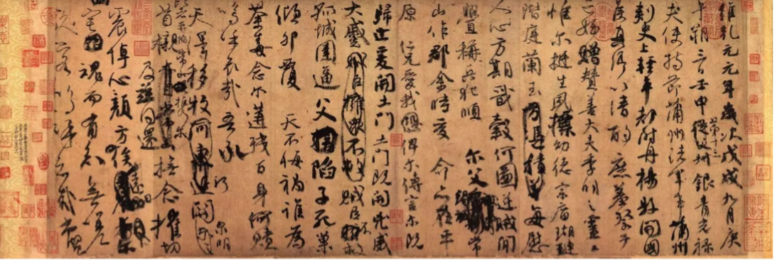
天下第二行书—唐·颜真卿《祭侄文稿》
唐代著名书法家颜真卿(708—784),《祭侄文稿》是其为祭奠自己的侄子颜季明所作。这篇书法作品体现出颜真卿书写时的感情起伏,起首凝重,篇末忘情。开篇书写时,字体大小匀称,浓纤得体。随着言词的深入,行书、草书渐趋相杂字形时大时小,行距忽宽忽窄,笔锋有藏有露。
The Second Great Running Script in the Wold-Manuscript in Memory of Nephew Yan Jiming by Yan Zhenqing of the Tang Dynasty
Yan Zhenqing, a prominent calligrapher of the Tang Dynasty (618-907), is renowned for his work "Manuscript in Memory of Nephew Yan Jiming," a piece that reflects the heartfelt sentiments of the writer towards his nephew. True to its title, the writing begins with a dignified tone and gradually transitions to a more composed conclusion, portraying the depth of the emotions involved. Initially, the characters are uniformly sized with consistent thickness. As the emotional intensity grows, a blend of running and cursive script emerges. The font size and spacing fluctuate, mirroring the fluctuating sentiments. Additionally, the brush alternates between being partially hidden and exposed, further illustrating the emotional nuances within the writing.
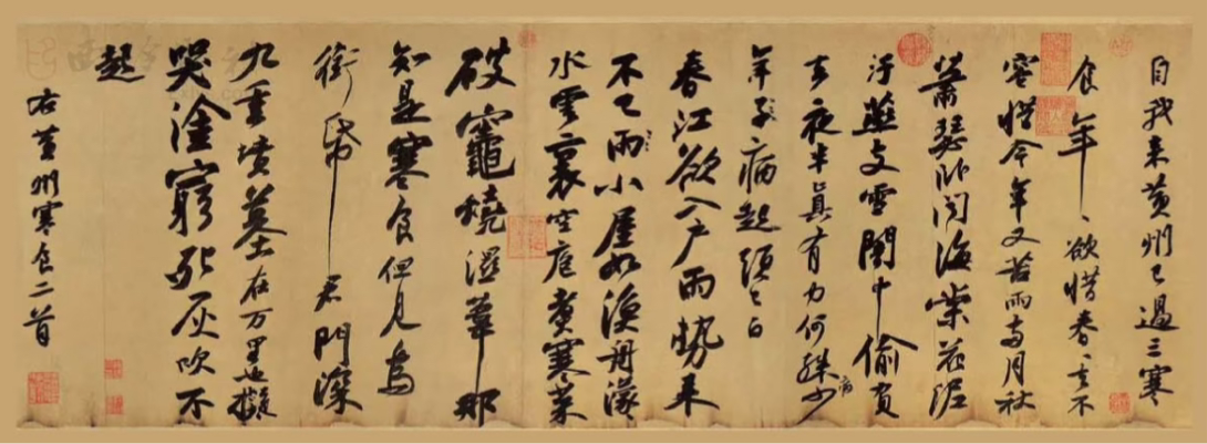
天下第三行书—北宋·苏轼《黄州寒食帖》
北宋著名文学家、书法家苏轼(1037—1101),号东坡居士,又称“苏东坡”。因作诗讥刺朝廷而被贬谪。这篇《黄州寒食帖》是他在宋神宗元丰二年(1079)被贬为黄州团练副使时所书行草。寒食即寒食节,清明节的前一天。这一天各家禁烟火,只吃冷食。通篇起伏跌宕,恣肆飞扬,痛快淋离,一气呵成。
The Third Great Running Script in the World-Cold Food Observance in Huangzhou Ciry, by Su Shi of the Northern Song Dynasty
Su Shi, also known as Su Dongpo, was a renowned scholar and calligrapher during the Northern Song Dynasty (960-1127). Due to his poem's criticism of the government, he faced banishment from the imperial court. "Cold Food Observance in Huangzhou City" is a semi-cursive script created during the Yuanfeng Period, specifically in the second year (1079) of Emperor Shenzong's reign. At that time, Su Shi had been exiled to Huangzhou and assumed the role of deputy commander of the local troops. The Cold Food Festival, preceding the Pure Brightness (Qingming) Festival, mandates the avoidance of fire in households and the consumption of cold food. This particular work is distinguished by its flowing rhythm, uninhibited brushstrokes, and an evident surge of passion, seemingly executed in one continuous flow.